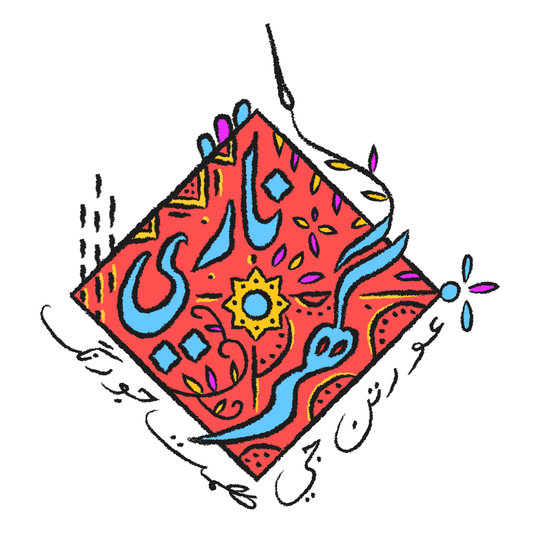
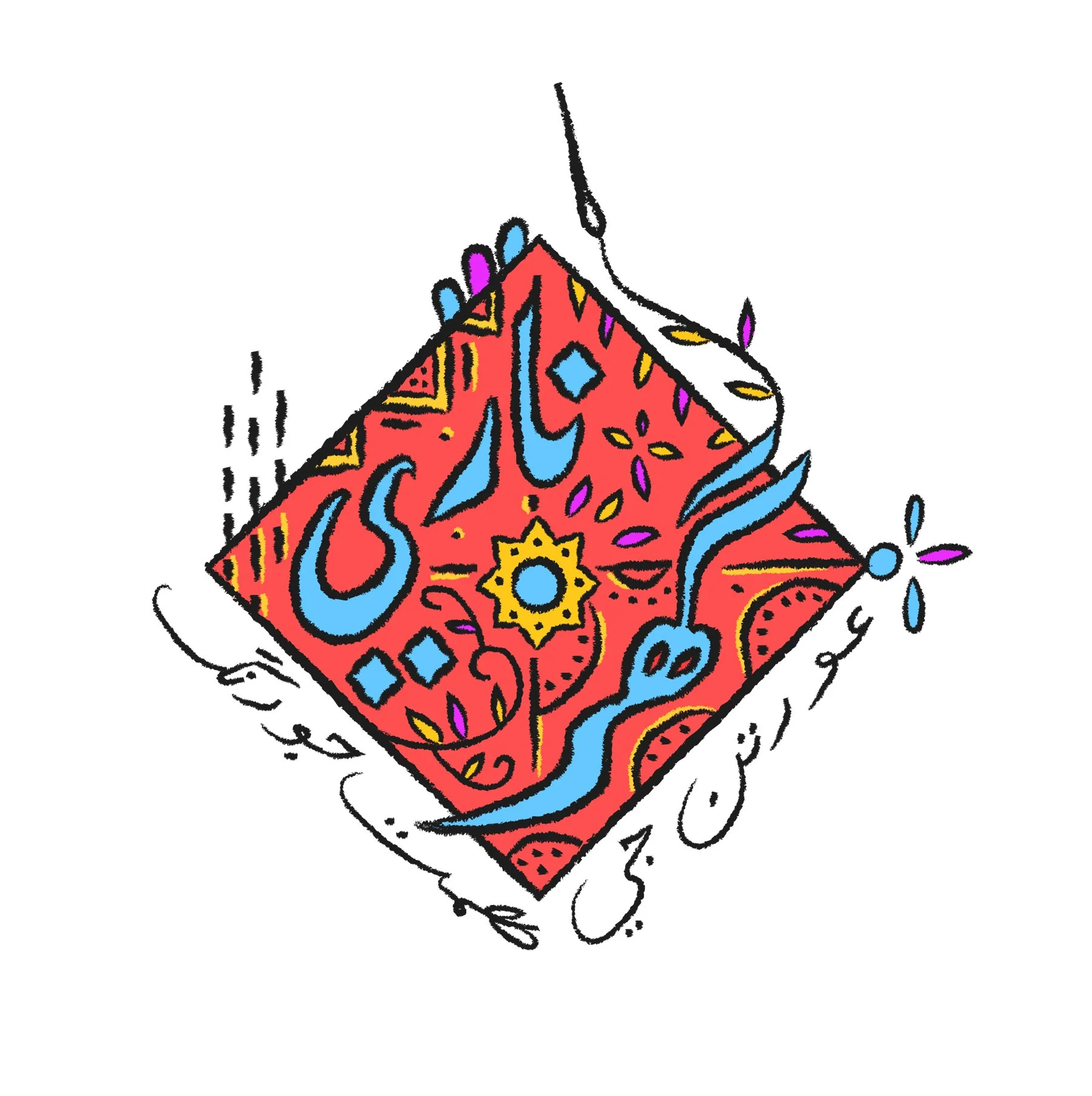
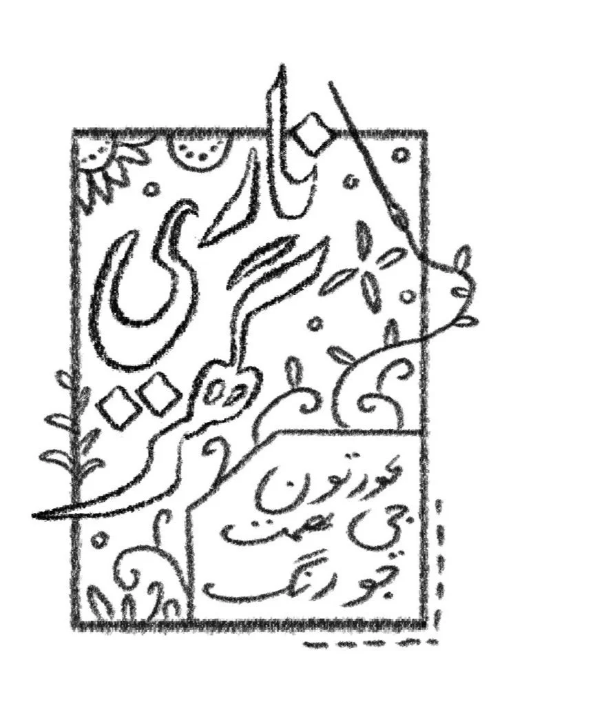
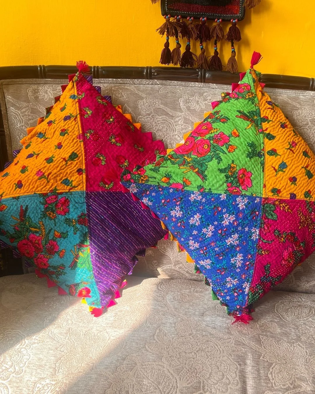
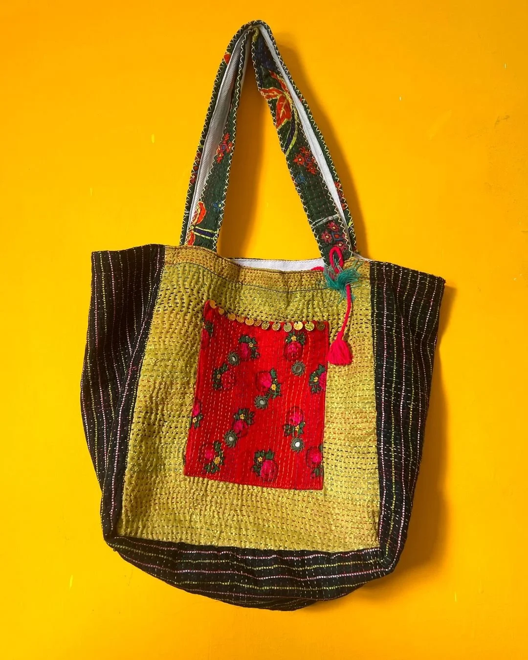
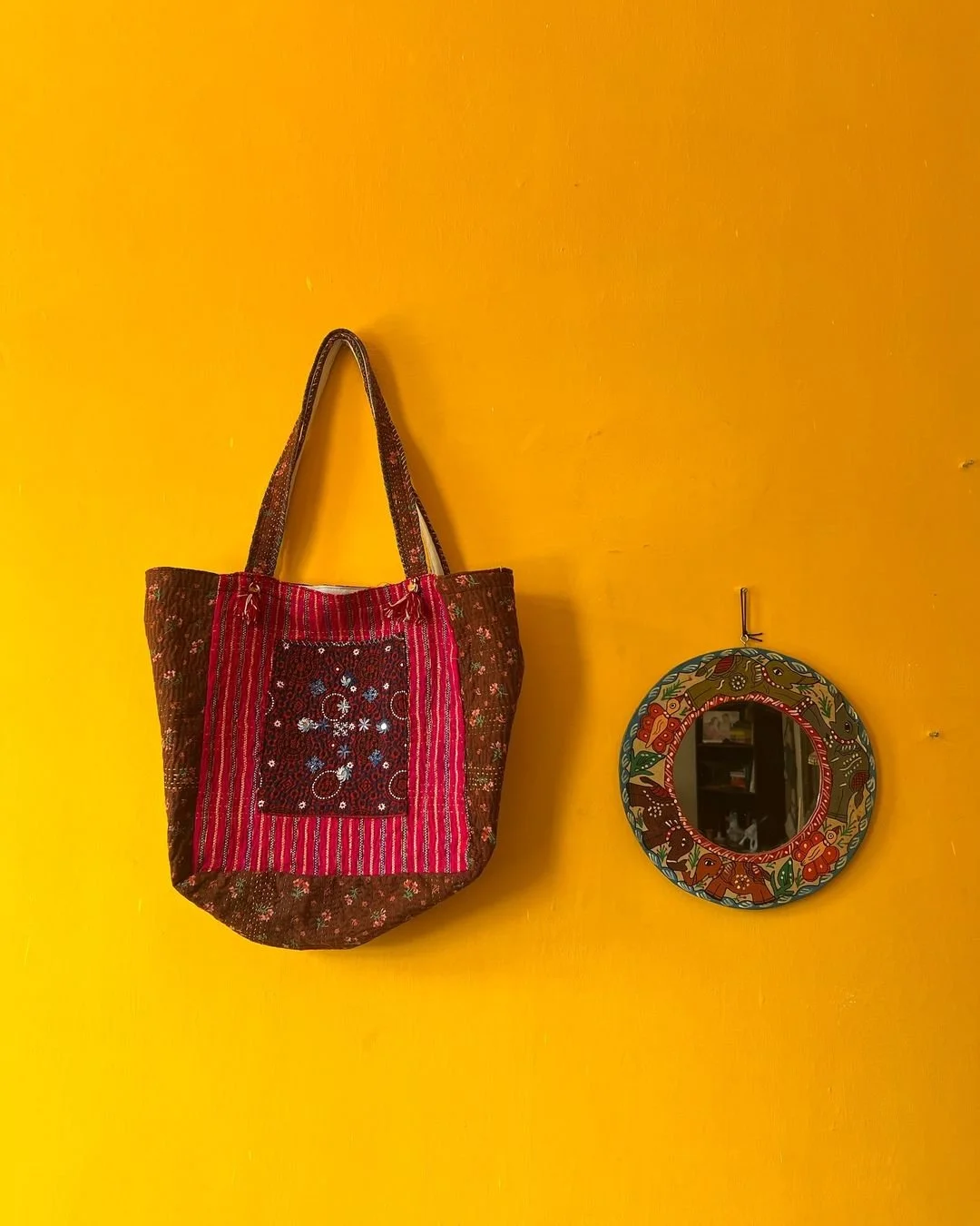
I was asked to create a logo for Naari Ghar, a women’s cooperative based in Sindh, Pakistan, made up of artisans and craftswomen who create handsewn bags and rallis (traditional quilts of Sindh), among other products.
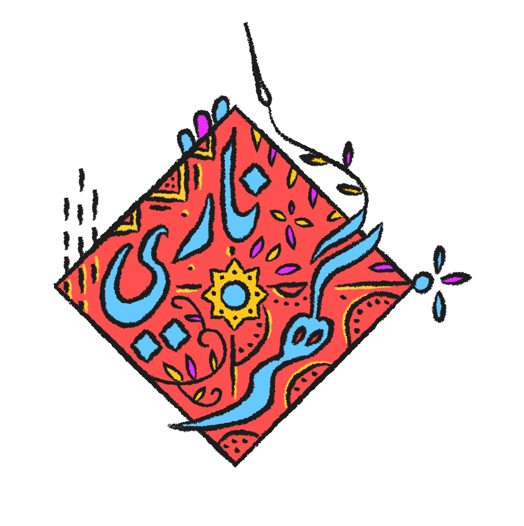
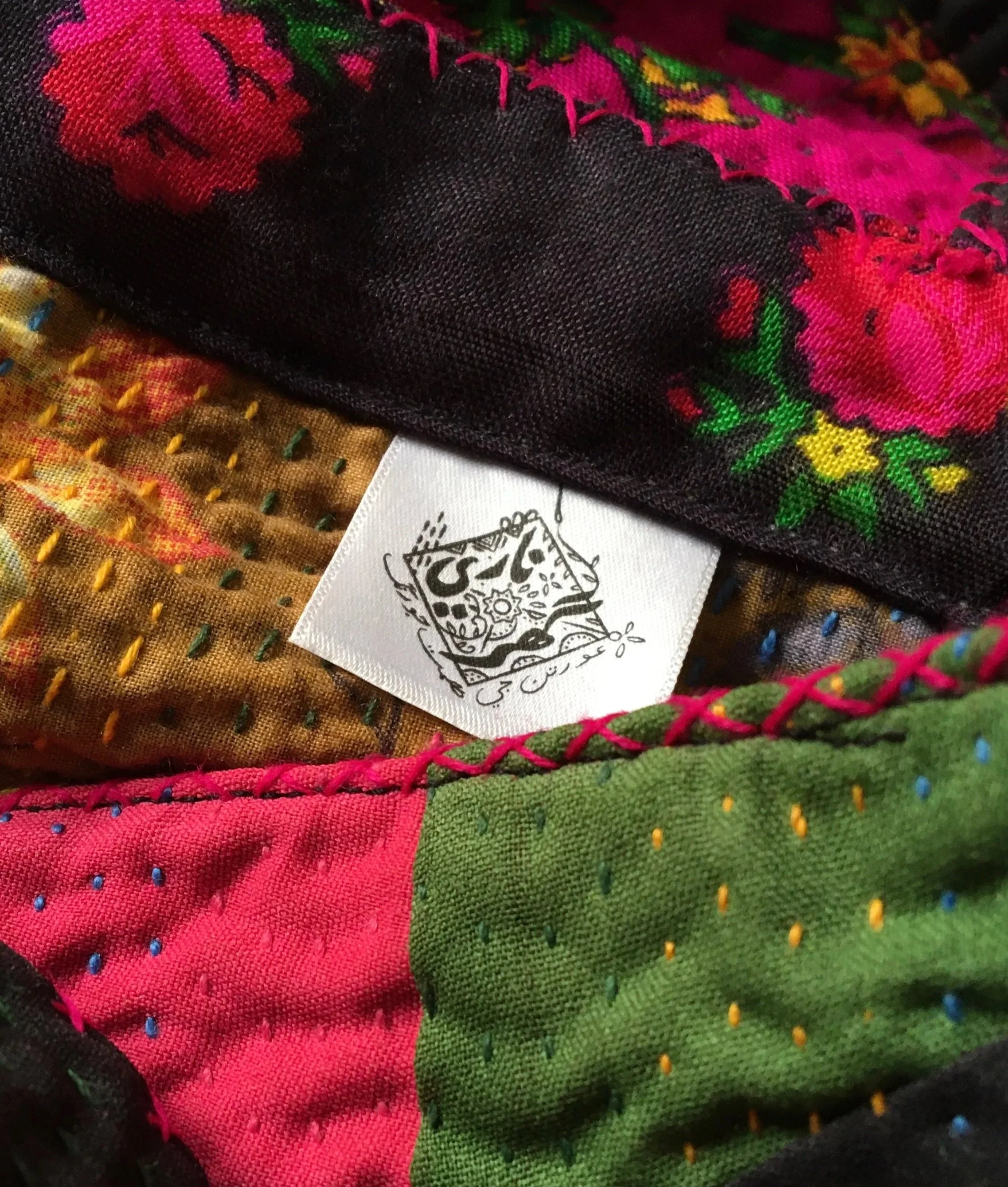
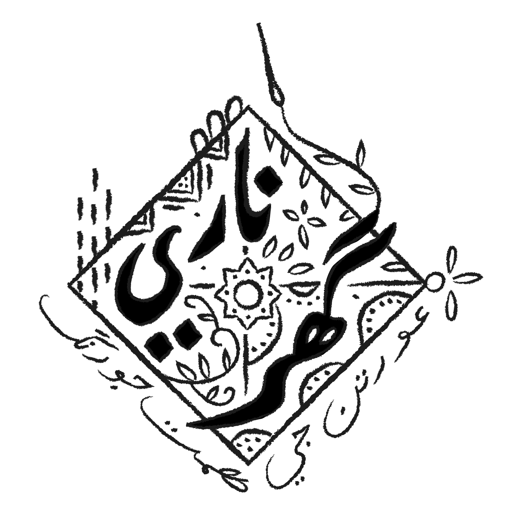
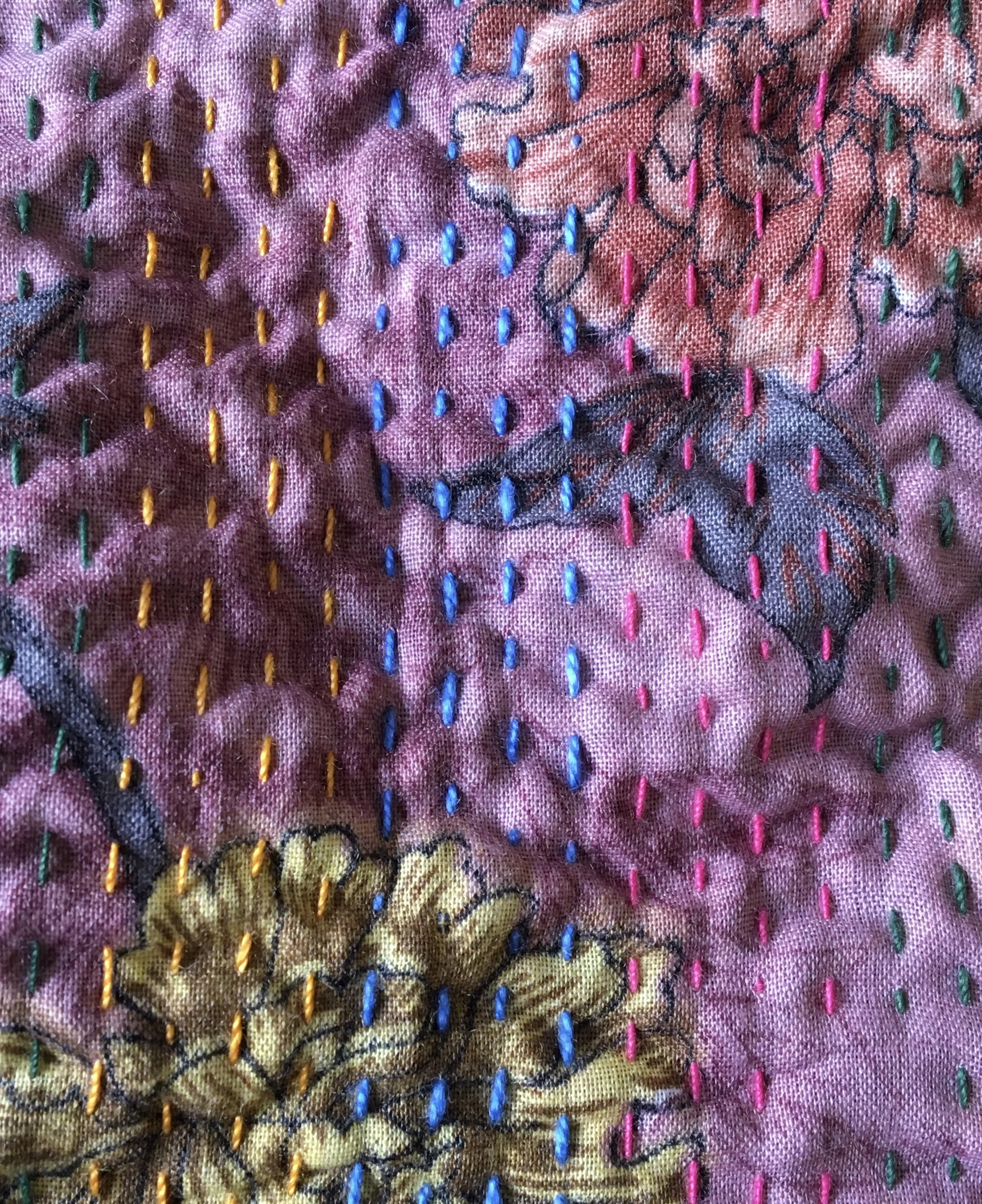
The logo design borrows from the colours, shapes, patterns and handstitched elements from each Naari Ghar product.
The hand-drawn, textured line work represents the slow and deliberate labour put in by all the hands working to create these pieces, where each product is unique, featuring a patchwork of fabrics through applique and embroidery.
The tagline, suggested by the Naari Ghar artisans, reads “the colour of women’s courage” in Sindhi.
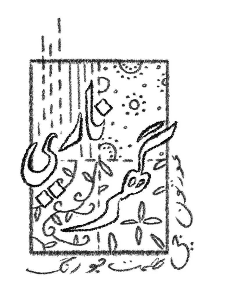
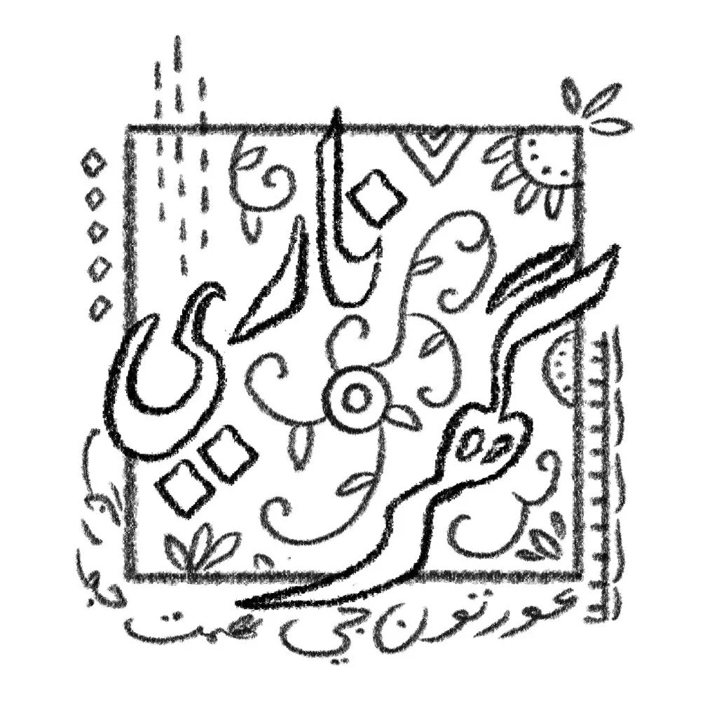
Initial logo iterations made while looking closely at Naari Ghar products.
“We are in no hurry. The embroidery in our part of the world has always been women’s storytelling. When women embroider, they drift away. Each stitch adds to the streamline of consciousness. Women produce slowly, working meticulously with patience, knowing fully well the embroidery will be completed eventually.”
- Naari Ghar
All photographs of Naari Ghar products are taken by and belong to Naari Ghar. To support them and purchase their pieces, follow them here.

